Statistical Methods
STATISTICAL METHODS

Description also available in video format (attached below), for better experience use your desktop.
Introduction
Data is collected first and then classified, analyzed, and tested using statistical methods.
Primary Data: Data collected directly from the original source or individual.
Example: Census data collected from people in 1991.
Example: Health and disease information collected directly from a population.
Secondary Data: Data obtained from already existing records or other sources.
Example: Using census data while studying hospital records.
Advantage of Primary Data: It provides more accurate and specific information according to the study's needs, which secondary data may not provide.
TABULATION
Tables are used to present large amounts of statistical data in a simple and organized form.
Tabulation is the first step before data analysis and interpretation.
A table may be simple (single set of data) or complex (multiple sets of data).
Principles of Good Tabulation
Every table should be properly numbered (Table 1, Table 2, etc.).
Each table must have a brief and self-explanatory title.
Row and column headings should be clear and concise.
Data should be arranged according to size, importance, chronology, alphabetical order, or geographical order.
Percentages and averages to be compared should be placed close together.
Tables should not be excessively large.
Vertical arrangement is generally preferred because it is easier to read.
Footnotes may be added to provide explanations or additional information.
Simple Tables –
|
TABLE 1 - Population of some states in |
|
|
States |
Population 2001 |
|
Andhra
Pradesh MP UP |
75 727 541 82 878 796 60 385 118 116 052 859 |
|
TABLE 2 Population of |
|
|
Year |
Population |
|
1901 1921 1981 1991 2001 |
238
396 000 251
321 000 685
185 000 843
930 000 1027
015 247 |
Frequency Distribution Table –
- In a
frequency distribution table, the data is first split up into convenient
groups (class intervals) and the number of items (frequency) which occur
in each group is shown in the adjacent column.
- Example: The
following figures are the ages of patients admitted to a hospital with
poliomyelitis. Construct a frequency distribution table.
- 8,24,18,5,6,12,4,3,3,2,3,23,9,
18, 16~ 1,2,3,5, 11, 13, 15,9, 11, 11, 7, 106, 9, 5, 16,20,4,3,3,3',
10,3,2, 1,6, 9,3,7,14,8,1,4,6,4,15,22,2,1,4,7,1,12,3,23,4,19,6,
2,2,4,14,2,2,21,3,2,9,3,2,1,7,19
- The data
given above may be conveniently analysed as shown below:
|
Age group |
Frequency |
|
0-4 5-9 10-14 15-19 20-24 |
35 18 11 8 6 |
· The data, analysed
above, is prepared frequency table as shown below:
|
TABLE 3 - Age
distribution of polio patients |
|
|
Age group |
No. Of pts |
|
0-4 5-9 10-14 15-19 20-24 |
35 18 11 8 6 |
- In the
above example, the age is split into groups of five. These are known as class intervals.
- The number
of observations in each group is called frequency.
- In
constructing frequency distribution tables, the questions that arise are:
Into how many groups the data should be split? And what class intervals
should be chosen?
- As a
practical rule, it might be stated that when there is large data, a
maximum of 20 groups, and when there is not much data, a minimum of 5
groups, could be conveniently taken.
- As far as
possible, the class intervals should be equal, so that observations could
be compared.
- The merits
of a frequency distribution tables are, that it shows at a glance how many
individual observations are in a group, and where the main concentration
lies.
- It also
shows the range, and the shape of distribution.
Charts and diagrams are useful tools for presenting statistical data in a simple and attractive way.
They create a strong visual impact and are widely used in newspapers and magazines.
The effectiveness of a chart or diagram depends on how well it is designed.
Diagrams are easier to remember than statistical tables.
The data presented through diagrams should be simple and easy to understand.
Simple diagrams reduce the chances of misunderstanding by readers.
However, simplicity may lead to a loss of details and accuracy.
Some information from the original data may not be shown in charts and diagrams.
For detailed analysis, it is necessary to refer back to the original data.
1. Bar Charts –
- Bar charts
are merely a way of presenting a set of numbers by the length of a bar -
the length of the bar is proportional to the magnitude to be represented.
- Bar charts
are a popular media of presenting statistical data because they are easy
to prepare, and enable values to be compared' visually.
- The
following are some examples of bar charts.
- (a) SIMPLE BAR CHART: Bars may be
vertical or horizontal (Fig. 1 and Fig. 2). The bars are usually separated
by appropriate spaces with an eye to neatness and clear presentation. A suitable
scale must be chosen to present the length of the bars.

- (b) MULTIPLE BAR CHARTS: Fig. 3
gives an example of a multiple bar chart or a compound bar chart. Two or
more bars can be grouped together. In Fig. 3, population and land area by
region are compared.
- (c) COMPONENT BAR CHART: The bars
may be divided into two or more parts... each part representing a certain
item and proportional to the magnitude of that particular item (Fig. 4).

2.
Histogram –

- It is a
pictorial diagram of frequency distribution.
- It consists
of a series of blocks (Fig. 5).
- The
3) Pie
Charts –
o
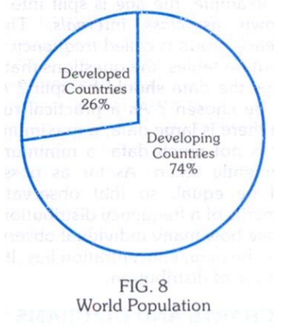
Instead of
comparing the length of a bar, the areas of segments of a circle are compared.
The area of each segment depends upon the angle. Pie charts are extremely popular
with the laity, but not with statisticians who consider them inferior to bar
charts. It is often necessary to indicate the percentages in the segments (Fig.
8) as it may not be sometimes very easy, virtually, to compare the areas of
segments.
4)
Pictograms

Pictograms
Pictograms are a popular method of presenting data using small pictures or symbols.
They are easy to understand, especially for people who cannot interpret traditional charts.
Each picture or symbol represents a specific quantity.
Fractions of a symbol can be used to show values smaller than a whole unit.
Example: A picture of a doctor can represent the population served per physician.
Pictograms make data attractive and easy to understand at a glance.
In essence, a pictogram is a type of bar chart that uses pictures instead of bars.
STATISTICAL
AVERAGES
- The word "average" implies a value in the distribution, around which the other values are distributed.
- It gives a mental picture of the central value.
- There are several kinds of averages, of which the commonly used
are: - (1) The Arithmetic Mean, (2) Median and (3) The Mode.
- The Mean - The arithmetic mean is widely used in statistical calculation. It is sometimes simply called Mean. To obtain the mean, the individual observations are first added together, and then divided by the number of observations. The operation of adding together is called 'summation' and is denoted by the sign L or S. The individual observation is denoted by the sign " and the mean is denoted by the sign x (called "X bar").
- The mean
(x) is calculated thus: the diastolic blood pressure of 10 individuals was
83, 75, 81, 79, 71, 95, 75, 77, 84, 90. The total was 810. The mean is 810 divided by 10 which
is 810.
- The advantages of the mean are that it is easy to calculate and understand.
- The disadvantages are that sometimes it may be unduly influenced by abnormal values in the distribution.
- Sometimes it may even look ridiculous; for instance, the average number of children born to a woman in a certain place was found to be 4.76, which never occurs in reality.
- Nevertheless, the arithmetic mean is by far the most
useful of the statistical averages.
The Median –


Median
Median is a measure of central tendency that does not depend on the total sum of observations.
To find the median, arrange the data in ascending or descending order.
The middle value of the ordered data is called the median.
Calculation of Median
If the number of observations is odd, the median is the middle value.
If the number of observations is even, the median is the average of the two middle values.
Advantages of Median
Easy to calculate and understand.
Not affected by extremely high or low values (outliers).
Gives a more representative value when data contains abnormal observations.
Example
Data: 5, 5, 5, 7, 10, 20, 102
Mean = 154 ÷ 7 = 22
Median = 7 (middle value)
In this example, the value 102 greatly affects the mean but does not affect the median. Therefore, the median is often more representative than the mean when extreme values are present.
Mode
Mode is the value that occurs most frequently in a dataset.
It is also known as the most common or most fashionable value in a distribution.
Example: If the value 75 appears more times than any other value, then the mode = 75.
Advantages of Mode
Easy to identify and understand.
Not affected by extremely high or low values (outliers).
Disadvantages of Mode
Its exact value may sometimes be unclear.
A dataset may have more than one mode or no mode at all.
Less useful for scientific, biological, and medical statistics.
Conclusion
The mode represents the most frequently occurring value in a distribution and is useful for identifying the most common observation.
MEASURES OF
DISPERSION
- The daily
calorie requirement of a normal adult doing sedentary work is laid down as
2,400 calories. This clearly is not universally true.
- There must
be individual variations. If we examine the data of blood pressure or
heights or weights of a large group of individuals, we will find that the
values vary from person to person. Even within the same subject, there may
be variation from time. The questions that arise are: What is normal
variation? And how to measure the variation?
- There are
several measures of variation (or "dispersion" as it is
technically called) of which the following are widely known: (a) The Range;
(b) The Mean or Average Deviation; (c) The Standard Deviation;
(a) The Range –
- The range
is by far the simplest measure of dispersion. It is defined as the
difference between the highest and lowest figures in a given sample. For
example, from the following record of diastolic blood pressure of 10
individuals
- 83,75,81,79,71,90,75,95,77,94.
- It can be
seen that the highest value was 95 and the lowest 71. The range is
expressed as 71 to 95 or by the actual difference (24). If we have grouped
data, the range is taken as the difference between the mid-points of the extreme
categories. The range is not of much practical importance, because it
indicates only the extreme values between the two values and nothing about
the dispersion of values between the two extreme values.
(b) The Mean
Deviation –
- It is the
average of the deviations from the arithmetic mean.
- It is given
by the formula:
- M.D = [∑( x
-
- Example: The
diastolic blood pressure of 10 individuals was as follows: 83, 75,81, 79,
71, 95, 75, 77,84 and 90. Find the mean deviation.
- Answer
(Mean deviation)
|
Diastolic B.P. |
Arithmetic Mean |
Deviation from the Mean |
|
x |
|
(x - |
|
83 |
81 |
2 |
|
75 |
81 |
-6 |
|
81 |
81 |
0 |
|
79 |
81 |
-2 |
|
71 |
81 |
-10 |
|
95 |
81 |
14 |
|
75 |
81 |
-6 |
|
77 |
81 |
-4 |
|
84 |
81 |
3 |
|
90 |
81 |
9 |
|
Total = 810 |
|
Total = 56 (ignoring ± sign) |
- Mean
= 810 / 10; = 81;
- The
Mean Deviation = 56/10 = 5.6
(c)
The Standard Deviation –
- The
standard deviation is the most frequently used measure of deviation. In
simple terms, it is defined as "Root - Means Square -
Deviation." It is denoted by the Greek letter sigma s or
by the initials S.D. The standard deviation is calculated from the basic
formula:
- S.D.
=
- When
the sample size is more than 30, the above basic formula may be used
without modification. For smaller samples, the above formula tends to
underestimate the standard deviation, and therefore needs correction,
which is done by substituting the denominator (11-1) for T]. The modified
formula is as follows:
- S.D.
=
- The
steps involved in calculating the standard deviation are as follows:
- (a)
First of all, take the deviation of each value from the arithmetic mean, ® (x -
- (b)
Then, square each deviation ® (x -
- (c)
Add up the squared deviations S( x -
- (d)
Divide the result by the number of observations h ® [or (h - 1) in
case the sample size is less than 30]
- (e)
Then take the square root, which gives the standard deviation.
- Example: The diastolic blood pressure of 10
individuals was as follows: 83, 75, 81, 79, 71, 95, 75, 77, 84, 90.
Calculate the standard deviation.
|
Answer |
|
|
|
X |
(x - |
(x - |
|
83 |
2 |
4 |
|
75 |
-6 |
36 |
|
81 |
0 |
- |
|
79 |
-2 |
4 |
|
71 |
-10 |
100 |
|
95 |
14 |
196 |
|
75 |
6 |
36 |
|
77 |
4 |
16 |
|
84 |
3 |
9 |
|
90 |
9 |
81 |
|
|
|
Total = 482 |
- S.D.
=
- The
meaning of standard deviation can only be appreciated fully when we study
it with reference to what is described as normal curve. For the present, we may contend with the
basic significance of standard deviation - that it is an abstract number;
that it gives us an idea of the 'spread' of the dispersion; that the
larger the standard deviation, the greater the dispersion of values about
the mean.
Sampling
Sampling is the process of selecting a small group (sample) from a large population for study.
It is easier, faster, and more economical than studying the entire population.
The sample should be representative of the population to ensure accurate results.
Sampling Frame
A sampling frame is a complete list of all members of the population from which the sample is selected.
The accuracy of the sampling frame affects the quality of the sample.
Sampling Methods
1. Simple Random Sampling
Each unit in the population has an equal chance of being selected.
Random numbers are used to choose the sample.
Minimizes personal bias and provides the greatest number of possible samples.
2. Systematic Random Sampling
Every nth unit (e.g., every 5th or 10th) is selected after a random starting point.
Example: 4, 14, 24, 34, etc.
Easy to use but offers fewer possible samples than simple random sampling.
3. Stratified Random Sampling
The population is divided into strata (groups) such as religion, age, sex, etc.
Samples are then selected from each group.
Useful when population groups are not equally distributed.
Sampling Errors
Differences that occur when different samples are taken from the same population.
Arise because only a sample, not the whole population, is studied.
Factors Affecting Sampling Error
Sample Size – Larger sample → Smaller error.
Variability of Data – Greater variation → Larger error.
Non-Sampling Errors
Errors not related to sample selection.
May occur due to:
Faulty or poorly calibrated instruments.
Observer bias or variation.
Incomplete data collection.
Conceptual or recording errors.
Often more serious than sampling errors.
Standard Error –
- If we take a random sample (h) from the population, and similar samples over and over again we will find that every sample will have a different mean (m).
- If we make a frequency distribution of all the sample means drawn from the same population, we will find that the distribution of the mean is nearly a normal distribution and the mean of the sample means practically the same as the population mean (m).
- This is a very important observation that the sample means are distributed normally about the population mean (m).
- The
standard deviation of the means is a measure of the sample error and is
given by the formula
- Since
the distribution of the means follows the pattern of a normal
distribution, it is not difficult to visualize that 95 per cent of the
sample means will lie within limits of two standard error [m ± 2 (
- Therefore standard error (S.E.) is a measure which enables us to judge
whether the mean of a given sample is within the set confidence limits or
not.
|
Confidence limits |
Normal deviate (N.D.) = (x - m) / |
Significance |
|
m is outside
the 95 per cent confidence limits |
N.D. > 2 |
P < 0.05; Significant at 5% level |
|
m is just
within 95 per cent confidence limits |
N.D. =2 |
P = 0.05; Just significant at 5%
level |
|
m is within
the 95 per cent confidence limits |
N.D. < 2 |
P > 0.05; Not significant at
5% level |
·
Don’t forget to do
these things if you get benefitted from this article
o
Visit our Let’s
contribute page https://keedainformation.blogspot.com/p/lets-contribute.html
o
Follow our page
o
Like & comment
on our post
·
Comments