Data Presentation
DATA PRESENTATION
Description also
available in video format (attached below), for better experience use your
desktop.
Introduction
· A method in
which the peoples
o
Organize
the information
o
Summarize
the information
o
Communicate
the information
· By using a
variety of tools such as
o
Tables
o
Graphs
o
Diagrams
Types of Data Presentation
1.
Tabular
Presentation
2.
Visual
Presentation
a.
Graphical
Presentation
b.
Diagrammatical
Presentation
1.
Tabular
Presentation
a.
It
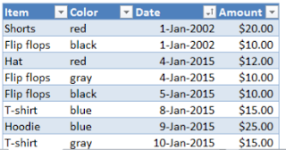
is a systematic and logical arrangement of classified data in rows and columns
b.
It
simplifies the complex data and avoid unnecessary repetition
c.
Facilitates
comparison & gives identity to the data
d.
The
rules of the tabulation includes
i. Assigned a
number to the table
ii. Always give a
title to the table
iii. Group intervals
in columns & rows should neither be too narrow nor too wide
iv. Any used short
form/symbol must be explained in the footnote
v. Unit of measurement
should be mentioned clearly
e.
The
tables can be classified as
i. On the basis of Purpose
1.
Reference tables
·
Present
the original data for reference purposes only
2. Text tables
·
Constructed
to present selected data from one or more general purpose tables
ii. On the basis of Content
1.
Simple tables
·
Having
data relating to only one characteristics
2.
Double tables
·
Having
data relating to only 2 characteristics
3. Triple tables
·
Having
data relating to only 3 characteristics
4.
Multiple tables
·
Having
data relating to more than 3 characteristics
2.
Visual
Presentation
a.
It
is a graphical and diagrammatical presentation of a data
b.
Attractive,
original, simple and economical are the rules of a good Visual presentation
c.
The
Visual presentation divided into two categories
i. Graphs
ii. Diagrams
GRAPHS
1.
Histogram
·
Represented
by a set of rectangular bars
·
Variables
is taken on X-axis & Frequency is taken on Y-axis
·
With
the class intervals as base, rectangles with height proportional to the class
frequency are drawn
·
The
set of rectangular bar so obtained gives a histogram
·
The
total area of the rectangles in a histogram represent total frequency
·
&
if the total frequency distribution has inclusive class intervals, they should
be converted into exclusive type
·
Mode
of distribution can be easily obtained from the histogram
2.
Frequency Curve
·
Variables
is taken along the X-axis and frequencies along the Y-axis
·
Frequencies
are plotted against the class mid-value and then, these points are joined by a
smooth Curve known as Frequency curve
·
Total
area under the frequency curve represents the total frequency
3.
Frequency
Polygon
·
Variables
is taken along the X-axis and frequencies along the Y-axis
·
Frequencies
are plotted against the class mid-value and then, these points are joined by a straight
Line known as Frequency Polygon
·
Total
area under the frequency curve represents the total frequency
4.
Ogives
·
Ogives
is a smooth graph with cumulative frequency (cf) plotted against value of
variables (class limits)
·
Class
limits are taken along X-axis and cf along
Y-axis
·
The
two ogives are drawn together with common axis
·
The
points of intersection of the two ogives gives the median point of the
distribution
5.
Line Graph
·
Used
to display the comparison between two variables, plotted on the X & Y-axis
·
The
X-axis represents measure of time and Y-axis represents the percentage or measures
of quantity
·
Line
graphs displays the change in direction
·
It
shows the trend of an event occurring over a period of time to know whether it
is increased or decreased
DIAGRAMS
1.
PIE Diagram
·
Presents
discrete data of qualitative characteristics such as blood groups, Age, Sex
etc.
·
Frequencies
of a group are shown in a circle
·
Degrees
of angle denotes the frequency and area of the sector
·
Size
of each angle is calculated by multiplying the (frequency/total frequency) by
360⸰
2.
BAR Diagram
·
Consist
of series of rectangular bars of equal width standing on a common baseline with
equal gap between one another
·
The
bars can be either horizontal or vertical
·
Bars
are constructed in such a way that their
length are proportional to the magnitudes (frequency)
·
The
bar diagrams are further classified as
i. Simple Bar diagram
ii. Subdivided Bar
diagram
iii. Percentage Bar
diagram
iv. Multiple Bar
diagram
v. Deviation Bar
diagram
Video description
Don’t forget to do these things if you get benefitted from this article
o Visit our Let’s contribute page https://keedainformation.blogspot.com/p/lets-contribute.html
o Follow our page
o Like & comment on our post


Comments